You could always change that in the tileinfo. Just download CK456D.tli and use it to fix the defective tile property. Save as Keen4.tli, then put this patch into your patch file:
%tileinfo keen4.tli
Commander Keen 9.5 The Eight Accumulators...
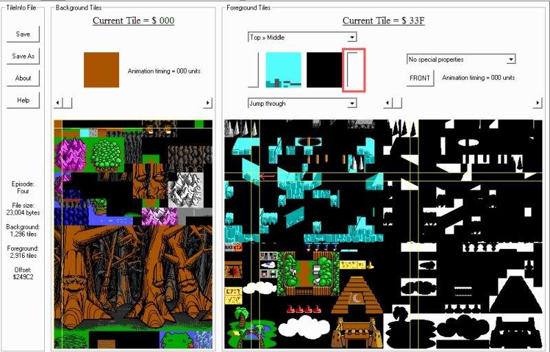
Select the tile which I have selected in this picture, click the tab that I've drawn the red box around, then save. Make sure you have the keen4.tli file in your mod folder. Also make sure, like Gridlock mentioned, that you have
Code: Select all
%tileinfo keen4.tli


Looking neat, I like the way the sand is swept right into the 'ice' tiles.
The mushroom looks out of place, like it was just thrown in. I know it is supposed to be on the ramp, but yeah.
Keen's eyes are too big; kind of like a cartoon character that is awestruck. Is this what you were aiming for?
Some things I notice about Keen's hand and arm:
The hand is a bit tall and there isn't a discernible wrist. The arm is too uniform in width; widen it a bit as it gets toward the elbow. Keen's upper arm is strangely sized in comparison to the forearm. The arm comes out of the sleeve awkwardly.
Hope these observations help with improvement.
-
DaVince

- lazy/busy Keener
- Posts: 1476
- Joined: Thu Nov 01, 2007 15:34
- Location: Amsterdam, Netherlands
- Contact:
Regaring title screen pic: the arms are completely straight and the upper arm is really thick. The lower arm is also too short, and his arm sticks out of his shirt in an impossible angle. You should probably lower the shirt pipe's angle and width. The palms of his hands are also too big, and the grey lines in it make his hands/fingers look wrinkled; they should be a bit more subtle.
Keen's pupils are also too large.
That's about all the improvements I can think of right now for the title screen. Other than that, I really dig the font and dithering work!
As for the other screen shots... The big oracle thing doesn't seem quite straight... The level design looks classic and cool. I'm hoping by looking at that slope that the BWB level is an actual level!
Wow look at me I'm lurking