
Yet another mod to look forward to playing.
I enjoy your work
introduce myself and a permission request

-
Dr.Colossus

- Vortininja
- Posts: 89
- Joined: Thu Aug 02, 2012 20:47
- Location: Germany
"Star Wars Text" and "Story Screen":
http://www.youtube.com/watch?v=Aiyq_nRj ... e=youtu.be
http://www.youtube.com/watch?v=Aiyq_nRj ... e=youtu.be
Interesting. I did not think that the vorticons had that capacity of intelligence.Dr.Colossus wrote:"Star Wars Text" and "Story Screen":
http://www.youtube.com/watch?v=Aiyq_nRj ... e=youtu.be
Join us for netkeen! irc://irc.foonetic.net/netkeen
Stay classy, Scarlet.
Ha, you really are a fucling legend aren't you you neocon netnanny.
By jove... You have exceptional taste in games, Scarlet!
-
KeenEmpire
- Intellectuality
- Posts: 855
- Joined: Thu Nov 01, 2007 0:38


I echo KeenEmpire and hope that a level or two will take place on the Vorticon Mother Ship.
I really like the story; having the focus not be on Keen to start with while still being something familiar (the vorticons) establishes both a depth to events and provokes imagination, since Keen's presence and thoughts are largely left to the player to decide.
There are a number of instances where things are phrased in an over explanatory manner. I think the story could use a few very minor edits to sharpen it up. Happy to help with that if you like
I also agree with wiivn about Lt. Barker; I hope you decide to redraw him, that image from Keen 7 is kind of embarassingly silly compared to your very stern grunt.
This brings me lastly to graphics. I'm not sure if you're looking for input at this time, but here are my thoughts if you're interested:
Title Screen:
I really like the creature on Keen's head, as well as Keen's expression! How about some slime or something smeared on the monster's brain, or some dripping on Keen's shirt? Keen's tongue appears a little small for his mouth, and seems a little too vertical. Add some light grey where the monster touches Keen's skin so that it looks like it's really latching onto his head.
The episode font is very plain. How about something that harkens to old sci-fi thrillers, like this: Terror from Outer Space
The background seems to be a copy of one of the in-level backgrounds. Again, I think the title screen would appear much more exciting with a backdrop like those in old scifi movie posters or book covers; something that doesn't necessarily create a scene the way the original Keen title screens did, but rather something that explodes with thematic images (The Vorticon Mother ship, planets, asteroids, the Vorticon facility, brain monsters spawning, et)c.
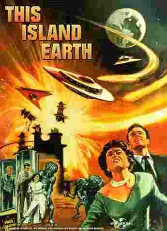
These classics might provide some ideas for background composition: Forbidden Planet, The Day the Earth Stood Still, Battle in Outer Space, Planet of the Vampires, and This Island Earth.
Story Graphics:
The menu screen image of Keen with some monster or splatter behind him feels very inferior in style to many of the other games images.
The vorticon Mothership looks really nice on the planet graphic, especially since they're both ripped from different games. I personally don't mind seeing ripped graphics when it is done well, and it looks nice here.
The Trogg image is okay, but very small; while this establishes some mystery about the nature and appearance of the creature, it feels ill-balanced/smothered by the amount of text. I think a bigger picture, or less text would look better. Also a darker background than white, maybe light or dark grey.
I hope these comments are helpful
I really like the story; having the focus not be on Keen to start with while still being something familiar (the vorticons) establishes both a depth to events and provokes imagination, since Keen's presence and thoughts are largely left to the player to decide.
There are a number of instances where things are phrased in an over explanatory manner. I think the story could use a few very minor edits to sharpen it up. Happy to help with that if you like
I also agree with wiivn about Lt. Barker; I hope you decide to redraw him, that image from Keen 7 is kind of embarassingly silly compared to your very stern grunt.
This brings me lastly to graphics. I'm not sure if you're looking for input at this time, but here are my thoughts if you're interested:
Title Screen:
I really like the creature on Keen's head, as well as Keen's expression! How about some slime or something smeared on the monster's brain, or some dripping on Keen's shirt? Keen's tongue appears a little small for his mouth, and seems a little too vertical. Add some light grey where the monster touches Keen's skin so that it looks like it's really latching onto his head.
The episode font is very plain. How about something that harkens to old sci-fi thrillers, like this: Terror from Outer Space
The background seems to be a copy of one of the in-level backgrounds. Again, I think the title screen would appear much more exciting with a backdrop like those in old scifi movie posters or book covers; something that doesn't necessarily create a scene the way the original Keen title screens did, but rather something that explodes with thematic images (The Vorticon Mother ship, planets, asteroids, the Vorticon facility, brain monsters spawning, et)c.
These classics might provide some ideas for background composition: Forbidden Planet, The Day the Earth Stood Still, Battle in Outer Space, Planet of the Vampires, and This Island Earth.
Story Graphics:
The menu screen image of Keen with some monster or splatter behind him feels very inferior in style to many of the other games images.
The vorticon Mothership looks really nice on the planet graphic, especially since they're both ripped from different games. I personally don't mind seeing ripped graphics when it is done well, and it looks nice here.
The Trogg image is okay, but very small; while this establishes some mystery about the nature and appearance of the creature, it feels ill-balanced/smothered by the amount of text. I think a bigger picture, or less text would look better. Also a darker background than white, maybe light or dark grey.
I hope these comments are helpful
-
troublesomekeen

- Vorticon Elite
- Posts: 1245
- Joined: Fri Feb 03, 2012 8:01
- Location: Three-Tooth Lake
- Contact:


He just had a dose of botox, in reality this is the worst day of his life.I also agree with wiivn about Lt. Barker; I hope you decide to redraw him, that image from Keen 7 is kind of embarassingly silly compared to your very stern grunt.
I LOVE the copied tiles in this game, they're very well mixed into the game, you'd hardly even notice them, especially the MB ones.
What you really need, not what you think you ought to want.

 You crack me up little buddy!
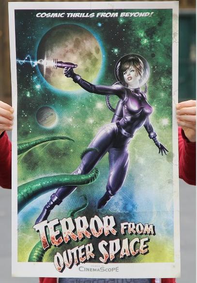
-
Dr.Colossus
- Vortininja
- Posts: 89
- Joined: Thu Aug 02, 2012 20:47
- Location: Germany
Updade:


I also finished the Worldmap.
Todo:
- Music
- Sounds
You're absolutely right with the Title Screen, so I redesigned it:Ceilick wrote: Title Screen:
I really like the creature on Keen's head, as well as Keen's expression! How about some slime or something smeared on the monster's brain, or some dripping on Keen's shirt? Keen's tongue appears a little small for his mouth, and seems a little too vertical. Add some light grey where the monster touches Keen's skin so that it looks like it's really latching onto his head.
Ceilick wrote: Story Graphics:
The menu screen image of Keen with some monster or splatter behind him feels very inferior in style to many of the other games images.
I also finished the Worldmap.
Todo:
- Music
- Sounds
I think you nailed that title screen!
Everything I've seen so far from your previews videos, the tie-in to the Voritcon series-- right up to you revealing the world map...this looks perfectly canon. This looks like the episode that never happened...until now.
I can't wait to play this!
Everything I've seen so far from your previews videos, the tie-in to the Voritcon series-- right up to you revealing the world map...this looks perfectly canon. This looks like the episode that never happened...until now.
I can't wait to play this!
"I just drew this stupid little fish." -- Tom Hall
-
Dr.Colossus
- Vortininja
- Posts: 89
- Joined: Thu Aug 02, 2012 20:47
- Location: Germany