Page 5 of 6
Posted: Sat Feb 01, 2014 21:13
by guynietoren
wiivn wrote:Or different colored lines. Like blue line for the blue gem holder and door.
Or if it is possible, pressing a switch to change the color of the line. Or change the line directions.
Btw, would it be possible, if you press a switch, to close a bridge and open other at the same time?
Would be an interesting challenge, instead of the normal Keen game play. I'm not sure yet on my tile limits, but I'm guessing lower color ones count for less memory. Currently the foreground and background lines are different tiles, since they are offset a bit.
Then again theoretically switches could make platforms appear out of nowhere, not just bridges. Would be cool to have parts of the level power on, that weren't visible before.
T-Squared wrote:guynietoren wrote: Not quite happy with the water, or Sea of Simulation. Just seems too bland so far.
Try making it look polygonal, like a primitive water simulation. (And that would basically be alternating pyramidal points moving up and down. It's hard to explain without a drawing.)
The original Tron used polygons for the sea. In Legacy it looks like real water, but with a glowing 3D grid points within it.
http://www.screened.com/sea-of-simulation/28-996/
Maybe it just needs texture on the surface.
Posted: Sun Feb 02, 2014 11:30
by Roobar
You should definitely watch Tron Uprising if you haven't yet.
Posted: Mon Feb 03, 2014 2:12
by guynietoren
wiivn wrote:You should definitely watch Tron Uprising if you haven't yet.
I've seen the whole series. I like it a lot. The only thing off about it is what Tron was wearing when Clu first attacked wasn't the same attire as in Legacy. It wasn't just slightly off, he wore all white instead of all black
Posted: Sat Feb 08, 2014 16:11
by guynietoren
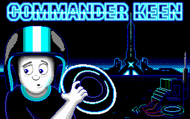
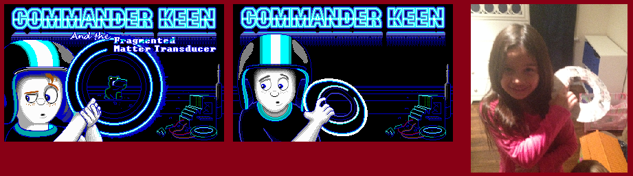
Progress has been a bit slow.
Here's the title screen progression. As well as one of my children posing, that I ended up using for tracing out the hand/disc/arms/etc..
I do like the helmet more than the original. Seems more rounded.
Posted: Sat Feb 08, 2014 18:35
by Levellass
I LIKE the way you think.
Posted: Sat Feb 08, 2014 19:38
by Roobar
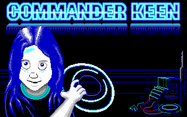
Why not use your girl instead?
Posted: Sat Feb 08, 2014 20:16
by Ceilick
Fantastic job, Guy! Really impressive revision and interpretation/style of the title screen Keen. I can see a few things that could be modified to better match the style of the original title keens, but I won't bring them up unless that's what you're interested, because this is superb.
The only thing that feels off are the helmet stripes; between being perfectly vertical and solid colored, it's a bit glaring. A hint of curvature, maybe a little (or complete) dithering might do it.
Posted: Sat Feb 08, 2014 20:16
by Nospike
I don't mean to be that guy again, but... OH MY GOD, that looks so creepy.
Posted: Sat Feb 08, 2014 21:27
by Paramultart
guynietoren wrote:Progress has been a bit slow.
Here's the title screen progression. As well as one of my children posing, that I ended up using for tracing out the hand/disc/arms/etc..
I do like the helmet more than the original. Seems more rounded.
That looks absolutely incredible. HUGE IMPROVEMENT!!!
Good idea on the tracing... I never would have guessed it would turn out that good.
Your kid is adorable, by the way.
Posted: Sun Feb 09, 2014 0:08
by guynietoren
Thanks for the compliments! You guys are a great encouragement for me. Thanks for the picture Wiivn. She got a real kick out of it!
Posted: Sun Feb 09, 2014 9:30
by Keening_Product
This is neat.
I like the stripes as they are, I don't think dithering or alterations are needed to help make it look 3D, but that's not to say a few minor tweaks wouldn't improve it even further.
One question though: where's the light source supposed to be? The Commander Keen logo at the top? The helmet has gloss on both sides is all.
Posted: Mon Feb 10, 2014 13:09
by guynietoren
Keening_Product wrote:This is neat.
I like the stripes as they are, I don't think dithering or alterations are needed to help make it look 3D, but that's not to say a few minor tweaks wouldn't improve it even further.
One question though: where's the light source supposed to be? The Commander Keen logo at the top? The helmet has gloss on both sides is all.
Though I haven't really thought about too much. There's not a real directional light source, as it comes from any and all objects. So the helmet glare is a reflection of 2 different things. Yes there's more detail I can add. Such as the glow of the disc has on Keen's helmet and such. I still have more space to add stuff in the background.
Posted: Mon Feb 10, 2014 14:18
by DoomJedi
Good work

Now things look more natural.
Posted: Fri Feb 28, 2014 9:48
by KeenRush
Forgot to post earlier: looks fantastic, really liking the tiles and the title screen. Haven't seen Tron in a while but liked it a lot ten years ago.

Looking forward to this one. It's great to see these crazy Keen projects appearing out of nowhere.
Posted: Fri Mar 14, 2014 12:09
by guynietoren
Progress is very slow at this point. But there's at least some. I haven't added any subtitle text to the title screen yet. But titlescreens are more of my stronger suit than the rest of the mod.