Page 37 of 70
Posted: Fri Dec 14, 2012 1:35
by VikingBoyBilly
That's funny. I find girls faces much easier. Their thinner chins and roundyness just lend themselves better to my simplistic and er... cutesy style. Quickest example I can find of my own work:
http://fc08.deviantart.net/fs71/f/2012/ ... 5i3cpy.png
There's a pretty decent guide on women's faces in How to Draw Comics The Marvel Way:
http://www.youtube.com/watch?v=gE868PdLb7k
I find their take on it... ah... kinda pig headed

No really, what's wrong with multiple eyelashes? But it's a place to start.
Posted: Fri Dec 14, 2012 12:13
by Keening_Product
I'm sorry, her face was the last thing to get my attention.
Posted: Mon Dec 17, 2012 2:31
by Levack
Celick's Lindsey looks (well,to me)rather bad,so I changed her eyes and hair. now she looks much better.
Posted: Mon Dec 17, 2012 6:23
by Nospike
Keening_Product wrote:I'm sorry, her face was the last thing to get my attention.
I'm kinda curious about what you did actually look at first then

Posted: Mon Dec 17, 2012 9:47
by Grimson
Nospike wrote:Keening_Product wrote:I'm sorry, her face was the last thing to get my attention.
I'm kinda curious about what you did actually look at first then
Propably the same inflated body part as I did.
Posted: Thu Jan 17, 2013 16:32
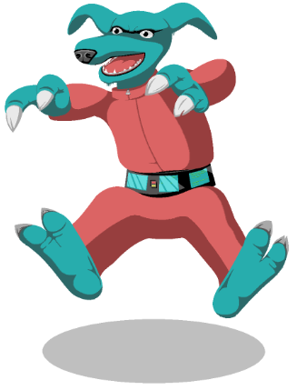
by guynietoren
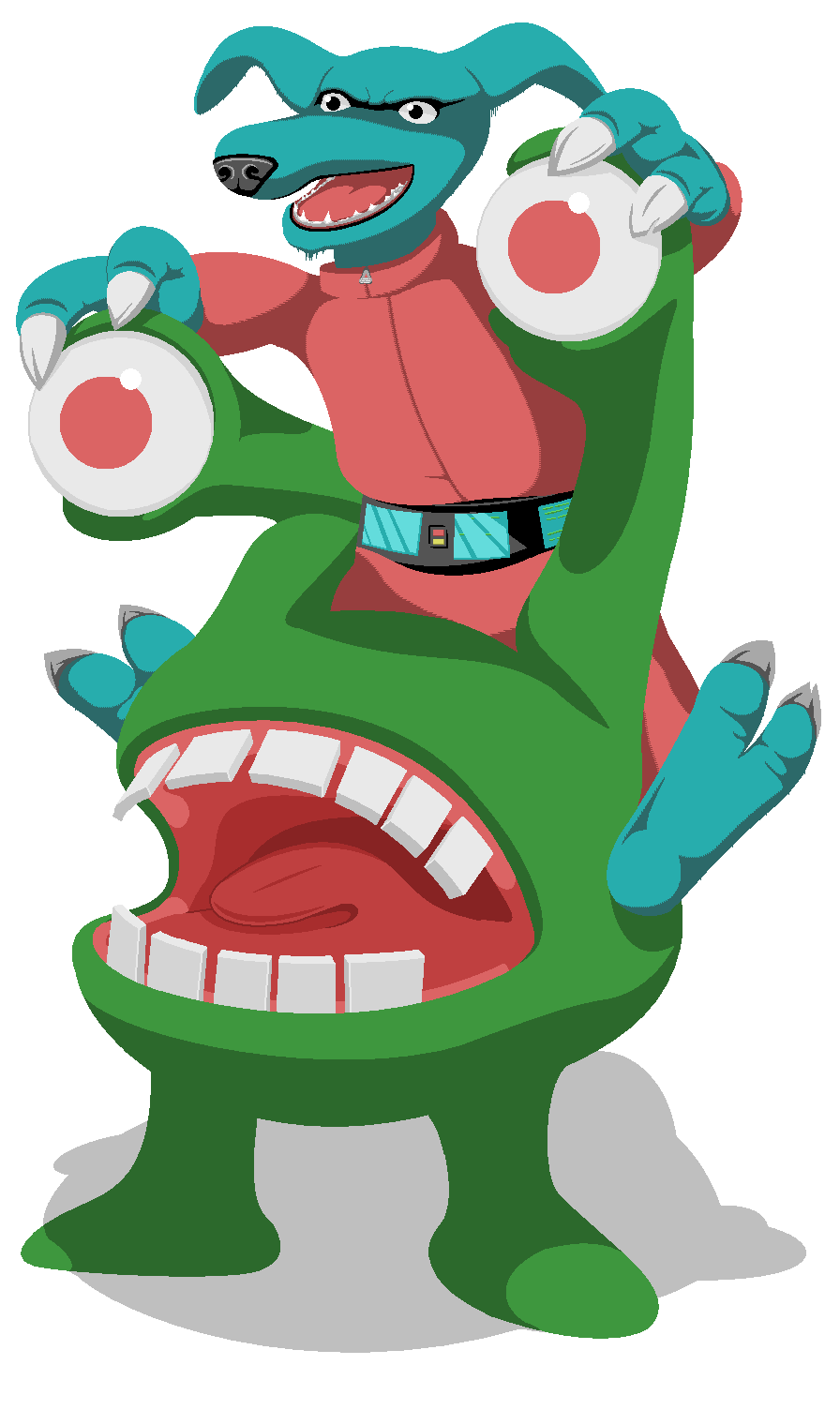
Been too long away from keen art.
Let me know if you see something I can improve on.
Click image for full size.
Posted: Thu Jan 17, 2013 20:13
by Flaose
Where are his opposable thumbs?! Maybe add some mind-control lights to his belt (assuming it's a hostile Vorticon). Overall great work though!
Posted: Thu Jan 17, 2013 20:31
by guynietoren
Perhaps he has 2 opposable thumbs with no fingers. Not sure if that's a thing at all. Can add belt gadgets later.
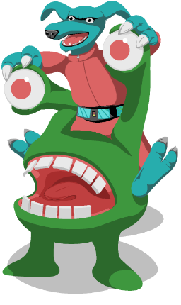
And here's this... I couldn't resist. Perhaps why the Vorts were interested in Mars.
Posted: Thu Jan 17, 2013 22:09
by Grimson
There's something wrong with his lower jaw...as if his collar was too tight.
Posted: Fri Jan 18, 2013 5:30
by Levellass
Indeed, it's like he's being strangled.
Commander Keen: The Too-Tight Tie!
Posted: Fri Jan 18, 2013 13:37
by guynietoren
Fair 'nuff. And I thought people would think the legs didn't look right. Or maybe they still don't, but the neck thing is too much to get past.
On second look, BT's comics didn't give them a collar or much of a jaw. I'll still have to figure out what I could change it too other than a ski suit.
Edit:
There I gave him a neck and lowered the collar. And the obvious change is the belt gadgets. And yes, I used the glare as an excuse to not draw more on the first and part of the second screen.
Posted: Sat Jan 19, 2013 7:47
by biffstudly
guynietoren wrote:Fair 'nuff. And I thought people would think the legs didn't look right. Or maybe they still don't, but the neck thing is too much to get past.
On second look, BT's comics didn't give them a collar or much of a jaw. I'll still have to figure out what I could change it too other than a ski suit.
Edit:
There I gave him a neck and lowered the collar. And the obvious change is the belt gadgets. And yes, I used the glare as an excuse to not draw more on the first and part of the second screen.

that looks awesome! The original did too, but the update even more-so. I love high res pixal art, especially because it's actually really difficult to make it look good. I usually limit myself to game sprite sizes. At the very most, like 300x300, and that's my extreme. You should upload this stuff to
Pixeljoint, I'm sure they'd love it, especially with the level of detail you throw into the pot.
I have to ask though (sorry if you already said earlier in the thread) what program do you use to make these? For pixel art I usually stick with Graphicsgale, just because I can customize my own palettes and keep it organized.
Once again though, awesome job, and an A1 job with the belt.
As a request, if you ever find the time (I have a baby too, haha I know it can be hard), I'd absolutely love to see a custom, original keen title screen in your style. It'd blow me away.

Posted: Sat Jan 19, 2013 9:33
by Grimson
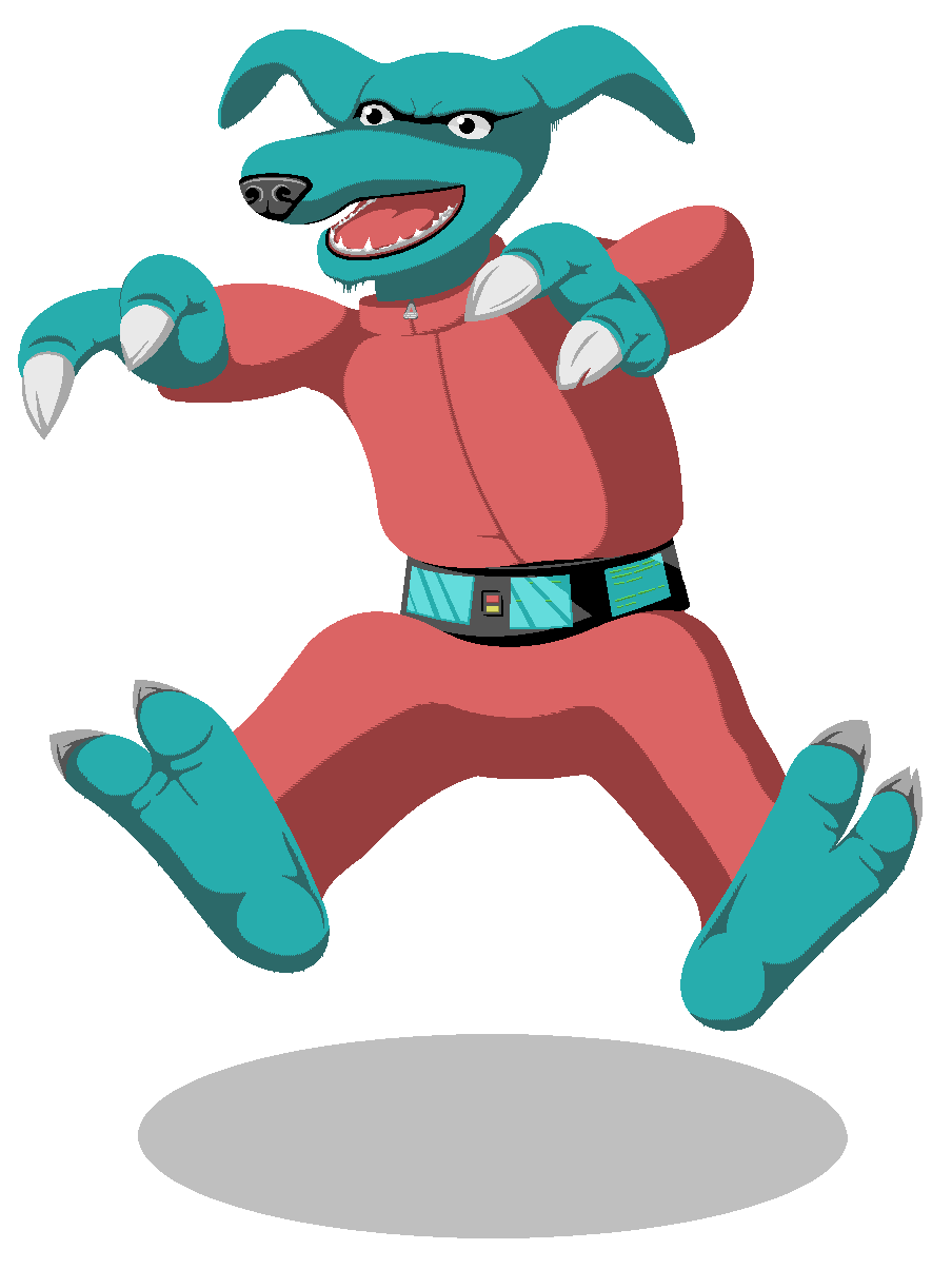
I know that since they are apparent carnivores, they naturally have strong and robust jaws. But it looks to me he's the Vorticon version of Ridge Forrester.
My suggestion in .png format:

Posted: Sat Jan 19, 2013 21:31
by guynietoren
biffstudly wrote:
You should upload this stuff to Pixeljoint
I have my stuff posted on
DeviantArt. That link should take you to my Keen art folder.
biffstudly wrote:
I have to ask though (sorry if you already said earlier in the thread) what program do you use to make these? For pixel art I usually stick with Graphicsgale, just because I can customize my own palettes and keep it organized.
It's all done on MSPaint. I prefer the Windows7 version except for the limit on the erase brush size for swapping colors. But yes it doesn't save color pallets like any other version of it.
biffstudly wrote:
I'd absolutely love to see a custom, original keen title screen in your style. It'd blow me away.
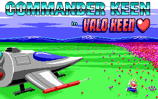
I did a title screen for Valentine's Keen, but haven't had time to play the mod. It's definitely on my to do list. This title screen borrowed some design elements from Space Quest 3, like with the ship rivets and mountains.
Grimson wrote:I know that since they are apparent carnivores, they naturally have strong and robust jaws. But it looks to me he's the Vorticon version of Ridge Forrester.
I do like him better with the jaw thinned out. So I'll end up working on that sometime. I may give him floppier ears. But the ones he has are just traced from scaled up sprites.
It does bug me a bit that my art style in this series is a bit inconsistent. The more detailed bits have up to 4 shades of the same color where the larger areas are stuck at 2. Especially when I was wanting to detail it more. But I still like how the colors turned out. Base colors are mostly toned down versions of EGA, as full saturated colors seem harsh on the eyes.
Posted: Tue Jan 22, 2013 12:42
by Keening_Product
That rocks.
That rocks Vorticon socks.