
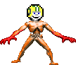
It stresses even more that the helmet is out of proportion,the smile is roughly painted on the face, and the plack lines are to thick. In stead of ugly oldschool emoticons you have updated quasi-nice-but-in-fact-really-ugly-emoticons. Forgive but I don't buy that.Shadow Master wrote:It's lovely, an anti-aliased smiley! That hit the nail.Djaser wrote:That doesn't look much better to me.Allstories wrote:Would maybe something like this be acceptable?
I can bear the old emotics as long as they don't have hard edges on my laptop.
It's time to replace these emoticons
Aaaah, not the bees!
-
DaVince

- lazy/busy Keener
- Posts: 1476
- Joined: Thu Nov 01, 2007 15:34
- Location: Amsterdam, Netherlands
- Contact:
Actually, it's no antialiased in the least. If it were, you'd see some transitional pixels from black to yellow, yellow to green etc. in the appropiate areas.Shadow Master wrote: It's lovely, an anti-aliased smiley! That hit the nail.
I can bear the old emotics as long as they don't have hard edges on my laptop.
It's just a lot smoother and hi-res now, and I love it.
-
KeenEmpire
- Intellectuality
- Posts: 855
- Joined: Thu Nov 01, 2007 0:38
Personally I never liked the original emoticons for their mixing of pixelated (zoomed in) original art, and higher resolution custom art.
If you recognise the original head first, the smaller lines in the face look out of place, and if you notice the face/emotion first, the pixelated outline just looks ugly due to its low detail.
It's just my opinion, but that has always bothered me a bit.
I say choose one style and stick with it.
Considering the original art is too tiny to show a whole range of emotions, why not base the emoticons on the art used in the games' ending sequences, or the art in the title screens and packaging.
Retodon8
Sheep happens
Sheep happens
-
kuliwil
- Blue-tongued Yorp
- Posts: 1731
- Joined: Wed May 12, 2010 8:51
- Location: Facestalking Commander Spleen.
- Contact:
(Y)
I agree entirely. The new one may be cute.... but it's not QUITE Keen.CK Guy wrote:Meh, call it conservative if you will, but I'd like to just stay with the old pixely ones.
Keenishness(:)) > Keenishness()

-
kuliwil
- Blue-tongued Yorp
- Posts: 1731
- Joined: Wed May 12, 2010 8:51
- Location: Facestalking Commander Spleen.
- Contact:
Re: It's time to replace these emoticons
Allstories wrote:Seriously, they could not be any less aesthetically pleasing. Lets get some ideas rolling. Here's some examples I made in like 10 minutes:

That is pro, Allstories. But yeah, the old ones are.... as a newcomer to this forum, they really do scream KEEN at me. They keep the forum on-topic I guess.
In the words of the kids on the taco ads (in Australia at least
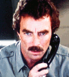
"Hi, I'm Tom Sellick's moustache."


-
StupidBunny

- format c:
- Posts: 2155
- Joined: Fri Nov 02, 2007 19:19
- Location: The Centre of the Moon
- Contact:

-
mortimermcmirestinks

- Owner of Club Vort
- Posts: 492
- Joined: Mon Aug 30, 2010 20:46
- Location: Shadowlands
I'll just end this thread here:
...NAZIS!
(Godwin's Law, by the way)
...NAZIS!
(Godwin's Law, by the way)
...says the most charming guy in the room.
I'm back... kind of? Not really.
You can also find me here.
I'm back... kind of? Not really.
You can also find me here.

It's not the mention of Nazis that does it, it's comparing people to them...
You Nazi!

You Nazi!
Cereal Board!
(Cereal wiki has sadly died)Deltamatic wrote:Prepositions are things I end sentences with.
-
Galaxieretter
- Arachnut
- Posts: 891
- Joined: Thu Nov 01, 2007 2:35
- Location: Lancaster PA
- Contact: