Page 4 of 10
Posted: Tue Nov 06, 2007 19:52
by KeenEmpire
i actually Would vote for that as secondary sub-logo
Posted: Tue Nov 06, 2007 20:03
by DSL
Well i guess we all can help making the perfect logo (through me)

I think it will take some time to perfect the logo since my computer got really unstable and i though it was done for, but i just got it fixed (with only 512mb RAM left in it)... I gotta see if it's stable enough to work on

Posted: Tue Nov 06, 2007 20:39
by ckguy
KeenRush wrote:Hah, nice, except you probably meant it as a joke, no?
What a hurtful thing to say!
Posted: Tue Nov 06, 2007 21:13
by DaVince
LUK AT MIE LOGO!1

Posted: Tue Nov 06, 2007 21:18
by grafix
That idea could actually work quite nicely, if you based it off the original confused Keen face by Carmack and added a little pixelated thought bubble.
Posted: Tue Nov 06, 2007 21:27
by KeenRush
Not bad at all, especially if it were a bit smaller (but resizing is easy, too).
Posted: Tue Nov 06, 2007 22:33
by Lava89
LOL, yeah it was a joke.
Posted: Tue Nov 06, 2007 22:44
by DaVince
Mine, too. But if it can bring people to ideas...

You're on to something there, KeenRush. Hm!
Posted: Wed Nov 07, 2007 0:12
by Apocalypse Gohan
Posted: Wed Nov 07, 2007 0:15
by ckguy
Woah, Apocalypse Gohan, very nice! There is definitely something to be said for the retro appearance as opposed to the high-quality cg stuff of DSL's. My only complaint would be the Big V medal. I don't see Keen wearing that ever again after leaving Vorticon VI. (Or is it IV? Crap, how unKeen is it to forget that?!) He certainly doesn't wear it during dangerous missions (read: Keens 4,5,6).
[Edit] Something like this:
Does anyone think his chest looks too bare now?
[Edit again] Well, after thinking about it, I really like this. I'd be very happy with this as the logo.
Posted: Wed Nov 07, 2007 3:39
by Apocalypse Gohan
And this logo.
Maybe...


No medal for mort.
Posted: Wed Nov 07, 2007 3:43
by ckguy
Admins: is it possible to have two banners at the top of each page - one on either side of the "Public Commander Keen Forum / Your little slice of heaven. / FAQ / Search / Memberlist / etc." text? Cause we could have the Keen one on one side (I'm thinking the left) and the Mort one on the other.
Posted: Wed Nov 07, 2007 4:16
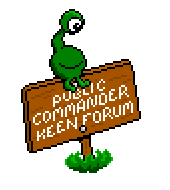
by Lava89
What about one logo atogether? Keen and Mort on opposite sides while on the same graphic.
Posted: Wed Nov 07, 2007 4:18
by MortimerInBlack
cool retro logos, but fyi, keen's helmet (actually his brother's) does not have a faceguard. it is always absent.
edit: and Mortimer should be all in black ^^
DEMO
Posted: Wed Nov 07, 2007 4:44
by Commander Spleen
Could do with some cleaning up, but it'll do for now.
MortimerInBlack wrote:keen's helmet (actually his brother's) does not have a faceguard. it is always absent.
In the first series it is present. The image is taken directly from the loading sprite of Keen 1. In Keen 4 it is removed, presumably for the cleaner appearance.
Also, Lava89's logo rocks.


