Welcome to the migrated PCKF!
-
Keening_Product
- Kuliwho?
- Posts: 2167
- Joined: Fri Jan 20, 2012 7:02
- Location: Tied up in the Oracle Chamber's basement
- Contact:
Re: Welcome to the migrated PCKF!
We could always have a few logos the page could randomly select on load. With the same dimensions for each etc. That might be quite fun!
Keening_Product was defeated before the game.
"Wise words. One day I may even understand what they mean." - Levellass
"Wise words. One day I may even understand what they mean." - Levellass

Re: Welcome to the migrated PCKF!
^ This. I like.Keening_Product wrote: ↑Sun Dec 24, 2017 16:14 We could always have a few logos the page could randomly select on load. With the same dimensions for each etc. That might be quite fun!
Writer. Translator. Player of games. Only bites when asked nicely.
"That's ten pounds of yikes in a five-pound bag."
"That's ten pounds of yikes in a five-pound bag."

Re: Welcome to the migrated PCKF!
We could also have random quotes/phrases load on the main page
mortimermcmirestinks wrote: Now I wish MoffD wasn't allergic to me.
Levellass wrote:You're an evil man.

Re: Welcome to the migrated PCKF!
why don't keep it simple? here's another proposal:
I think we should open the voting with the start of 2018. Until then, contributions will be accepted. we've got six options so far.
@Zilem:
Can you animate a floor-cleaning-Janitor, please. that'd be awesome!
I think we should open the voting with the start of 2018. Until then, contributions will be accepted. we've got six options so far.
@Zilem:
Can you animate a floor-cleaning-Janitor, please. that'd be awesome!
Last edited by Nisaba on Mon Oct 22, 2018 22:54, edited 3 times in total.
out now (link) : 

Re: Welcome to the migrated PCKF!
Wow, it's been one full year since the migration and update! 
Yeah I've been meaning to re-Keen-ify the place but somehow never got around to it, oops. Thanks everyone for your offers of help and graphics! Hopefully we can get at least a logo in soon.
Yeah I've been meaning to re-Keen-ify the place but somehow never got around to it, oops. Thanks everyone for your offers of help and graphics! Hopefully we can get at least a logo in soon.
Re: Welcome to the migrated PCKF!
Whoa, a whole year? I wasn't even a registered user yet then, but I was here to see the whole thing, just lurking in the shadows.... 
For the actual content of a logo, what represents PCKF as a whole? There's Commander Keen, obviously, and mods are also a big part of the community here, but I agree with Roobar; a bunch of sprites all smashed together doesn't really seem to cut it. I feel like when designing a logo, we should consider the points of what makes our community here unique, and somehow incorporate that into the design. What do you guys think?
I vote that we change this to be the logo now and replace the default phpBB one already, while we sort out a more permanent solution. The phpBB logo just kind of seems to give the impression of being just some standard website, and the sooner we replace it the better.

Ditto. Maybe one of them could be the old logo that was based off the "One Moment" image. What dimensions would that be though? If this was going to be a thing, I assume the artists involved would want to agree on a size beforehand. For that matter, do we have any particular dimensions we're trying to adhere to, or is it all just whatever anyone feels like? Is there a specific size we should try to design by?nanomekia wrote: ↑Sun Dec 24, 2017 17:51^ This. I like.Keening_Product wrote: ↑Sun Dec 24, 2017 16:14 We could always have a few logos the page could randomly select on load. With the same dimensions for each etc. That might be quite fun!
For the actual content of a logo, what represents PCKF as a whole? There's Commander Keen, obviously, and mods are also a big part of the community here, but I agree with Roobar; a bunch of sprites all smashed together doesn't really seem to cut it. I feel like when designing a logo, we should consider the points of what makes our community here unique, and somehow incorporate that into the design. What do you guys think?
"Friendly. Very friendly. Too friendly." 

Re: Welcome to the migrated PCKF!
Perhaps you should get out of the shadows more often to post here 
I think I've said this before, but if someone have had posted some guidelines with all the images that needs to be replaced (or something like that), we should have had new designs already. Nobody gave a fucl though. Now I have an idea. I think I might be even able to draw something to replace the whole forum banner. But again, I would need some guidelines and what's possible...
I think I've said this before, but if someone have had posted some guidelines with all the images that needs to be replaced (or something like that), we should have had new designs already. Nobody gave a fucl though. Now I have an idea. I think I might be even able to draw something to replace the whole forum banner. But again, I would need some guidelines and what's possible...
Re: Welcome to the migrated PCKF!
The original dimension of the Base phpBB image is 149x52 px.
There is a .html that accessible by the admin panel or file storage of the server, if the dimension of the logo is to be changed
We could also add a Keen and Mortimer theme to the forum, instead the Default White, light blue and Blue.
I'm pretty sure themes are just .css files... but there should be a theme editor in the Admin panel.
It's a while ago i tinkered with a phpBB forum's structure, at least Fleexy should know what I'm talking about.
hance why all have weapons drawn. including the Janitor ready to use it as staff and swing a wet mop in somethings face.
I think it will be a bit odd if the Janitor would mop the floor when standing off hostiles ready to engage.
oh wait.... you mean the Janitor all by himself mopping the floor. hmmm... i think i have an idea for that!
and why issn't it? Keen is obliviously in the center
with original and Community characters standing beside him.
Edit: Added picture of The Keen Gang
There is a .html that accessible by the admin panel or file storage of the server, if the dimension of the logo is to be changed
We could also add a Keen and Mortimer theme to the forum, instead the Default White, light blue and Blue.
I'm pretty sure themes are just .css files... but there should be a theme editor in the Admin panel.
It's a while ago i tinkered with a phpBB forum's structure, at least Fleexy should know what I'm talking about.
I Dunno if you can tell but the gang was based on a picture of keen surrounded enemies (the one you showed, try put them together)

hance why all have weapons drawn. including the Janitor ready to use it as staff and swing a wet mop in somethings face.
I think it will be a bit odd if the Janitor would mop the floor when standing off hostiles ready to engage.
oh wait.... you mean the Janitor all by himself mopping the floor. hmmm... i think i have an idea for that!
Indeed?proYorp wrote: ↑Fri Dec 29, 2017 11:52For the actual content of a logo, what represents PCKF as a whole? There's Commander Keen, obviously, and mods are also a big part of the community here, but I agree with Roobar; a bunch of sprites all smashed together doesn't really seem to cut it. I feel like when designing a logo, we should consider the points of what makes our community here unique, and somehow incorporate that into the design. What do you guys think?
and why issn't it? Keen is obliviously in the center
with original and Community characters standing beside him.
@ 148x78px dimension.
Edit: Added picture of The Keen Gang
Last edited by Zilem on Sat Dec 30, 2017 4:44, edited 1 time in total.
The Difference Between a Mod and Fan art?, a Fan art is a Concept and a Mod is that Concept put into life.
Re: Welcome to the migrated PCKF!
I meant the Janitor all by himself, swabbing and mopping the floor. as an animated gif. you could pixel the sprites and I'll animate him wiping the forums.
out now (link) :
Re: Welcome to the migrated PCKF!
Thanks!Roobar wrote: ↑Fri Dec 29, 2017 12:44 Perhaps you should get out of the shadows more often to post here
I think I've said this before, but if someone have had posted some guidelines with all the images that needs to be replaced (or something like that), we should have had new designs already. Nobody gave a fucl though. Now I have an idea. I think I might be even able to draw something to replace the whole forum banner. But again, I would need some guidelines and what's possible...
It looks to me like most of the banner, with the blue gradient rectangle, is rendered with HTML (or CSS?) and so would only be changed with code. It seems the actual logo is a gif image:
Then the rest of the banner is just text and the aforementioned blue background rectangle, so it looks like the only actual image that needs to be replaced is the one that's currently a phpBB logo. (Although, would it be technically possible to replace the blue rectangle with an actual background image if people really wanted it? What does Fleexy think about this?)
So there's my dissection of the banner in an attempt to assemble some guidelines. Somebody please correct me if I'm wrong about any of this.
It's not that it's a bad concept, it just seems like a really crowded picture to me. Maybe if the characters were spaced out just a tiny bit more, so that it's easier to tell where one character ends and another begins. Also maybe to give it a bit more depth, instead of having the characters' feet all on the same level, you could have Kylie and Lt. Barker raised a pixel or two above Keen, and Lindsey and Janitor a pixel or two above them. That could also help with the crowded feeling.Zilem wrote: ↑Fri Dec 29, 2017 16:14Indeed?proYorp wrote: ↑Fri Dec 29, 2017 11:52For the actual content of a logo, what represents PCKF as a whole? There's Commander Keen, obviously, and mods are also a big part of the community here, but I agree with Roobar; a bunch of sprites all smashed together doesn't really seem to cut it. I feel like when designing a logo, we should consider the points of what makes our community here unique, and somehow incorporate that into the design. What do you guys think?
and why issn't it? Keen is obliviously in the center
with original and Community characters standing beside him.@ 148x78px dimension.
But you know, I feel like if the logo is going to include sprites in it, it should be just one or two. Besides sprites being easy to get too crowded like seems to be the issue here, I kind of want to see more original drawing for the logo. A pile of sprites also seems to easily give the impression of being ripped and unoriginal somehow. That isn't to say I think sprites absolutely should not be included in the logo, especially since they are a big part of Keen, but I think it's easy to overdo it.
"Friendly. Very friendly. Too friendly."
Re: Welcome to the migrated PCKF!
It can be changed in the Administrator Panel, Which only the Admins have access to including anyone that admins tag with access,proYorp wrote: ↑Thu Jan 04, 2018 18:37 It looks to me like most of the banner, with the blue gradient rectangle, is rendered with HTML (or CSS?) and so would only be changed with code. It seems the actual logo is a gif image:
Then the rest of the banner is just text and the aforementioned blue background rectangle, so it looks like the only actual image that needs to be replaced is the one that's currently a phpBB logo. (Although, would it be technically possible to replace the blue rectangle with an actual background image if people really wanted it? What does Fleexy think about this?)
So there's my dissection of the banner in an attempt to assemble some guidelines. Somebody please correct me if I'm wrong about any of this.
The Banner Is technically part of the Default_Theme.CSS
we should get a Green Bay Packers "Keen" Theme, and make it the default
and Georgia Bulldogs "Mortimmer" Theme (for those of us that prefer darker colors)
If Fleexy gave me access to the Admin Panel, i could easily change the Banner and make the 2 themes i mention
I have been a Moderator on a forum that uses this Forum software, some of the things i did behind the scenes was setting up ranks/groups, Themes and user-group icons.
I'm Not saying Fleexy should tag me with access. in fact i hope not, i don't want to wear another Glorified Janitor Title.
Also, the Header which holds the Banner Form Text and the search bar is part of a file called Header.HTML
which can be accessed from the FTP part of the server.
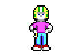
There is a reason why i didn't Put Kylie and the Janitor or L.T. Barker and Spot next to near each otherproYorp wrote: ↑Thu Jan 04, 2018 18:37 It's not that it's a bad concept, it just seems like a really crowded picture to me. Maybe if the characters were spaced out just a tiny bit more, so that it's easier to tell where one character ends and another begins. Also maybe to give it a bit more depth, instead of having the characters' feet all on the same level, you could have Kylie and Lt. Barker raised a pixel or two above Keen, and Lindsey and Janitor a pixel or two above them. That could also help with the crowded feeling.
But you know, I feel like if the logo is going to include sprites in it, it should be just one or two. Besides sprites being easy to get too crowded like seems to be the issue here, I kind of want to see more original drawing for the logo. A pile of sprites also seems to easily give the impression of being ripped and unoriginal somehow. That isn't to say I think sprites absolutely should not be included in the logo, especially since they are a big part of Keen, but I think it's easy to overdo it.
due to the colors, if they were close to each other they would meld together.
However, i see your other point... let me make some adjustment and abuse the power of Hot-updating files server side, and whoa'la!
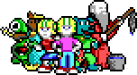
Outside of Spot and Keen (although he have a Green neural Stunner)
you can't rip the other sprites from anywhere. outside the Photoshop document or this Picture. ;p
(although Netkeen have a similar version of Lindsey, and spot, but once you rip them you'll see the difference)
The Difference Between a Mod and Fan art?, a Fan art is a Concept and a Mod is that Concept put into life.
Re: Welcome to the migrated PCKF!
made by Zilem: 
made by Commander Spleen:
made by ckguy: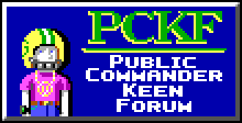
made by Commander Spleen:
made by ckguy:
Last edited by Nisaba on Mon Oct 22, 2018 22:54, edited 1 time in total.
out now (link) :
Re: Welcome to the migrated PCKF!
The phpBB-style "PCKF" one looks really nice as a temporary fix until I can get some custom CSS going on. Could someone please make a transparent version of it? I'd put it up immediately.
Regarding direct access to files on the server: unfortunately I can't allow that due to security concerns, but I'd be happy to look at and apply customized versions of theme files!
Regarding direct access to files on the server: unfortunately I can't allow that due to security concerns, but I'd be happy to look at and apply customized versions of theme files!
Re: Welcome to the migrated PCKF!
Unfortunately I didn't saved my source file. Here's a transparent one I made out of the existing one.
