Monster Bash art

Discuss classic and favorite computer or console games here.
Post Reply
User avatar
guynietoren
Vorticon Elite
Posts: 886
Joined: Sat Mar 13, 2010 2:57
Location: Kansas City
Contact:

Monster Bash art

Post by guynietoren »

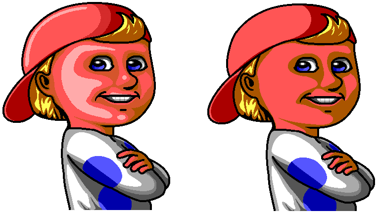
I took up Paramultart's suggestion to work on the Monster Bash intro screens.

Working on scaling up the first one times 4, and adjusting the detail.
Problem I'm having is a matter of opinion. I can't tell if adding extra dithering is helpful or not. It adds more depth but at the cost of its previous charm.

On a side note, my new baby is doing great! Sorry no pictures online to show yet.
Image
User avatar
Roobar
Vorticon Elite
Posts: 3276
Joined: Tue Jan 08, 2008 16:12
Contact:

Post by Roobar »

My very first thought without reading anything was that the one on the right is better.
User avatar
Stealthy71088
Vortininja
Posts: 174
Joined: Thu Nov 01, 2007 20:12
Contact:

Post by Stealthy71088 »

I think that would depend on whether or not you added a background. Depending on the situation, I can imagine one being much better than the other. The one on the left I think would look better than the right with a dark backdrop
Keening_Product
Kuliwho?
Posts: 2167
Joined: Fri Jan 20, 2012 7:02
Location: Tied up in the Oracle Chamber's basement
Contact:

Post by Keening_Product »

The extra dithering is great, but the one on the right is more child-like.

Also yay, happy baby!
Keening_Product was defeated before the game.

"Wise words. One day I may even understand what they mean." - Levellass
Post Reply