Page 2 of 4
Posted: Fri Oct 04, 2013 15:55
by Roobar
Paramultart wrote:Further on the subject of borders and outlines, I will let you guys in on my dilemma.
I really, really wanted to include the border and outline, but I never liked how it ate up so much of my art. When I tried to compensate for this by pulling out as many details above the border, it creates a weird third-dimensional paradox, as you can see below:
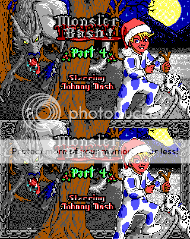
PS. I just realized that the version with the outlines was actually a slightly more recent version of the title-screen, with a few subtle changes in the shading.
/me seeing the borders version: No borders! DEFINITELY!
Posted: Fri Oct 04, 2013 16:02
by Paramultart
wiivn wrote:
/me seeing the borders version: No borders! DEFINITELY!
That's what I thought.
Posted: Fri Oct 04, 2013 23:24
by Levellass
That's us, Bashers Without Borders.
Posted: Sat Oct 05, 2013 11:07
by Commander Spleen
I think it needs the border to keep with the original style, but you need to be more selective with which elements overlap it.
Posted: Sat Oct 05, 2013 11:32
by Grimson
I agree with Spleen. I would put the base of the tree, gravestone, Johnny's leg, Tex and the hunchback of the werewolf behind the border.
Btw, holysheetthatsaververyveryneattitlescreenyougotthere. I don' think I mentioned that before.
Posted: Sat Oct 05, 2013 17:45
by Paramultart
I heard everything except for gravestone, Tex and Johnny's leg.
How's this... Warmer?

Posted: Sat Oct 05, 2013 17:48
by VikingBoyBilly
Looks decent. And now everyone who plays it will know who to hunt down with torches and pitchforks

Posted: Sat Oct 05, 2013 20:28
by Commander Spleen
You can probably keep the werewolf's claw in the foreground for ++argh;
Posted: Sat Oct 05, 2013 21:52
by troublesomekeen
Posted: Tue Oct 08, 2013 19:25
by tulip
I'm glad Spleen popped in as qualified consultant. This is exactly what the title screen needed.
Posted: Tue Oct 08, 2013 19:25
by Paramultart
Progress report:
Mostly tiles and music and stuff... I'll try to post some later.
Malv is currently working out some kinks in level editing, so that part of the development hasn't really started yet, other than jotting down ideas and whatnot.
Posted: Wed Oct 09, 2013 4:38
by Levellass
Excellent news, and we get an MB level editor out of the deal too?
Posted: Wed Oct 09, 2013 12:00
by Paramultart
Levellass wrote:Excellent news, and we get an MB level editor out of the deal too?
This is already one of the major features of Camoto studio; however, it is hardly functional at the moment, as the levels generated by it are somewhat corrupted and unbeatable. Malv is working hard to fix these issues, and I'm doing everything I can to help him.
Posted: Wed Oct 09, 2013 23:49
by Ceilick
So I just noticed this, and your question the other day makes sense now.
Really stunning, beautiful work on the title screen. I think the design on Johnny is great; the lankiness and expression on his face really set a tone for a young teen character.
Some thoughts/suggestions:
Consider using more brown and less black when sculpting his hair. This would seem to be more in line with the original titles.
Consider making the dimple of his cheek smaller, or closer to his mouth, or maybe adjust his jaw. It looks good right now, but I think it could be better.
Johnny's left knee looks a little wonky, or maybe it's his thigh. Could use some adjustment, definition.
Re the border: Firstly, design a new one. New series, new border (ideally one that is less obtrusive). Second, while the latest composition of elements looks the best, it is a shame to have the wolf's 'hump' obstructed, almost to the extent that I'd say it would be worthwhile to resize a lot of elements to get everything fitting and to the right proportions. Depends on how much work you want to do.
Consider outlining Spot in white to match Johnny.
Lastly, I would seriously consider upping the scale, at least a bit, of the "Monster Bash" logo. The current one
looks resized, which feels less professional than the rest.
Good luck with the project, certainly looking forward to it

Posted: Thu Oct 10, 2013 0:13
by VikingBoyBilly
Spot? Keen's yorp is in this?