Um, I'll just say that while that does look awesome, perhaps it is a little too red for the top. Isn't it double chocolate cake? Shouldn't it be a more of a darker brown then the rest of the cake? This is just my opinion though, so we shall see what others think.
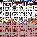
pizza2004 wrote:Here is the font graphic, with small letters:
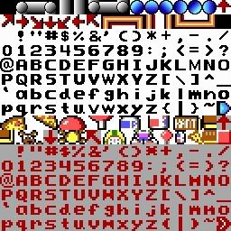
And here is a larger version I've been working on making more polished, eventually if we have the time we might make it so that you can have larger graphics for more detail. (If we do, given the amount of work, we probably won't have any more than double the size)
Well, I just uploaded new versions of both. The HQP font was slightly off with the borders, so I fixed it, and I massively improved the 2x res one. What does everyone think of that?
Okay, I want to say to Dreams, that your PM inbox might be full. Secondly, when you make the black outlined version make the darker things a tad lighter or slightly more cartoon colored, especially the sky, lighten it up for that version. Also, why no new posts lately? Did something happen? Could you come join our forum at clonekeenplus.neejean.org so we can get a hold of you easier. Also, it would be cool if you could just do HQ versions of every graphic in Keens 1-3 (except the font, we handled that already, although we'll have to fix the small graphics in it to match yours), that way we could use them in game.