ModMyi (one of the default apt repos of Cydia, the most common apt-get interface on the iPhone) has added Commander Genius to their repo.
http://modmyi.com/cydia/package.php?id=14192
Commander Keen for iPhone (based on Commander Genius)
Last edited by albert on Sat Nov 21, 2009 10:43, edited 1 time in total.
-
Deltamatic

- Vorticon Elite
- Posts: 1418
- Joined: Sun Apr 26, 2009 12:55
- Location: Shreveport, Louisiana
Wouldn't you accidently press pogo all the time? You only have one single finger on each side of the screen. So when I use the movement buttons, I tend to just move from left to right. That workes fine with the current way but not in your case (or at least it is harder to do).
For those who haven't seen the current way, take a look at the video (see first post).
For those who haven't seen the current way, take a look at the video (see first post).

 You crack me up little buddy!
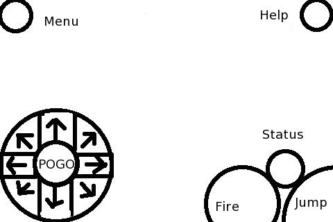
Well, originally I was making the layout a bit different, but then I decided to do that with the middle of the thing. As far as the diagonal not being needed in Keens 1-3, they are used on the map, and it is meant moreso to show an overlap area between two directions where you can move diagonally.
Here is what I was doing originally before I thought I could put the pogo in the center of the movement:
Here is what I was doing originally before I thought I could put the pogo in the center of the movement:
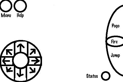
You could just press top+left at the same time to move diagonal - same way as with keyboard.
Also I think pogo+fire+jump should not be on the right side but on the bottom. The way you naturally keep your iPhone/iPod in your hand would make it difficult the way like in your draft (I think... perhaps we have just to try that out).
Also, status should be away from those main keys to keep the possible mistakes you can make minimal. I guess I would accidently press status very often in that draft.
Also, it's probably better to keep pogo+jump right next to each other.
I hold mine like this: 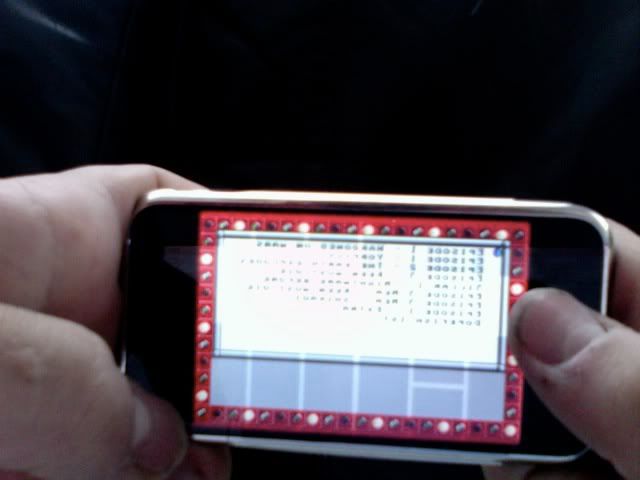
to me it is most natural to have them all at the sides of the screen, not the bottom. And also, with the directions I don't really want it to be big and round like that, I was just trying to show how all of the directions are possible. same with the Pogo and Jump, there wouldn't be an area specifically (unless you had to make it that way) for the fire in the middle. It would just be if you pressed both. So your square for the arrow keys works fine, but I want to have it have diagonal support. And the status is meant to sit right where a start button usually is, if you don't like that but it up next to the Menu and Help.
to me it is most natural to have them all at the sides of the screen, not the bottom. And also, with the directions I don't really want it to be big and round like that, I was just trying to show how all of the directions are possible. same with the Pogo and Jump, there wouldn't be an area specifically (unless you had to make it that way) for the fire in the middle. It would just be if you pressed both. So your square for the arrow keys works fine, but I want to have it have diagonal support. And the status is meant to sit right where a start button usually is, if you don't like that but it up next to the Menu and Help.
-
DaVince

- lazy/busy Keener
- Posts: 1476
- Joined: Thu Nov 01, 2007 15:34
- Location: Amsterdam, Netherlands
- Contact:
In pizza2004's layout, the status area is too close to the fire/jump areas. This would cause the status screen to open far too often.
Perhaps, for handhelds and similar devices without much in the way of keyboard input, the status screen and menu could be combined into one screen.
Perhaps, for handhelds and similar devices without much in the way of keyboard input, the status screen and menu could be combined into one screen.
Wow look at me I'm lurking
Oh, it is the picture, I took it with my web cam. And no, my layout is fashioned more for the new upcoming version of CG where we will have an in game menu. But I have a button for each command, the quit command and help command are new in this version of the game. So each on of those buttons is used in some way for a different purpose, but the help button isn't needed unless the menu is showing, so it could be the help button when the menu is opened and the status button otherwise. And we can display basic status in the top left corner like in Keens 4-6. But I have no idea when we will put in that display.
-
Deltamatic
- Vorticon Elite
- Posts: 1418
- Joined: Sun Apr 26, 2009 12:55
- Location: Shreveport, Louisiana