/me seeing the borders version: No borders! DEFINITELY!Paramultart wrote:Further on the subject of borders and outlines, I will let you guys in on my dilemma.
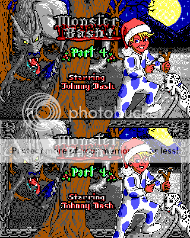
I really, really wanted to include the border and outline, but I never liked how it ate up so much of my art. When I tried to compensate for this by pulling out as many details above the border, it creates a weird third-dimensional paradox, as you can see below:
PS. I just realized that the version with the outlines was actually a slightly more recent version of the title-screen, with a few subtle changes in the shading.
... What I've been up to lately...
-
Paramultart

- VBB's Partner in Crime
- Posts: 3004
- Joined: Mon Jul 26, 2010 8:36

-
Commander Spleen

- Lord of the Foobs
- Posts: 2384
- Joined: Wed Oct 31, 2007 22:54
- Location: Border Village
- Contact:
I agree with Spleen. I would put the base of the tree, gravestone, Johnny's leg, Tex and the hunchback of the werewolf behind the border.
Btw, holysheetthatsaververyveryneattitlescreenyougotthere. I don' think I mentioned that before.
Btw, holysheetthatsaververyveryneattitlescreenyougotthere. I don' think I mentioned that before.
"All those thousands upon thousands of junk foods made for me on the various planets I explored make me wonder how I'm still alive."
-
Paramultart
- VBB's Partner in Crime
- Posts: 3004
- Joined: Mon Jul 26, 2010 8:36

-
VikingBoyBilly

- Vorticon Elite
- Posts: 4158
- Joined: Sat Jan 05, 2008 2:06
- Location: The spaghetti island of the faces of dinosaur world for a vacation
-
Commander Spleen
- Lord of the Foobs
- Posts: 2384
- Joined: Wed Oct 31, 2007 22:54
- Location: Border Village
- Contact:
-
troublesomekeen

- Vorticon Elite
- Posts: 1245
- Joined: Fri Feb 03, 2012 8:01
- Location: Three-Tooth Lake
- Contact:


 You crack me up little buddy!
-
Paramultart
- VBB's Partner in Crime
- Posts: 3004
- Joined: Mon Jul 26, 2010 8:36
-
Paramultart
- VBB's Partner in Crime
- Posts: 3004
- Joined: Mon Jul 26, 2010 8:36
This is already one of the major features of Camoto studio; however, it is hardly functional at the moment, as the levels generated by it are somewhat corrupted and unbeatable. Malv is working hard to fix these issues, and I'm doing everything I can to help him.Levellass wrote:Excellent news, and we get an MB level editor out of the deal too?
"Father Mabeuf was surveying his plants"
So I just noticed this, and your question the other day makes sense now.
Really stunning, beautiful work on the title screen. I think the design on Johnny is great; the lankiness and expression on his face really set a tone for a young teen character.
Some thoughts/suggestions:
Consider using more brown and less black when sculpting his hair. This would seem to be more in line with the original titles.
Consider making the dimple of his cheek smaller, or closer to his mouth, or maybe adjust his jaw. It looks good right now, but I think it could be better.
Johnny's left knee looks a little wonky, or maybe it's his thigh. Could use some adjustment, definition.
Re the border: Firstly, design a new one. New series, new border (ideally one that is less obtrusive). Second, while the latest composition of elements looks the best, it is a shame to have the wolf's 'hump' obstructed, almost to the extent that I'd say it would be worthwhile to resize a lot of elements to get everything fitting and to the right proportions. Depends on how much work you want to do.
Consider outlining Spot in white to match Johnny.
Lastly, I would seriously consider upping the scale, at least a bit, of the "Monster Bash" logo. The current one looks resized, which feels less professional than the rest.
Good luck with the project, certainly looking forward to it
-
VikingBoyBilly
- Vorticon Elite
- Posts: 4158
- Joined: Sat Jan 05, 2008 2:06
- Location: The spaghetti island of the faces of dinosaur world for a vacation